Screen resolution and browser support
Read what browsers and devices are supported by KTH Style and which ones should you support
General ideas
As a principle: avoid negative impact to all users; prefer to give the best experience to users with modern browsers and most used devices
-
Minimize accessibility or major usability issues. For example: a button is unusable or users cannot perform a task.
-
Avoid polyfills for minor usability or aesthetic issues (users can use the app but it might not look great). For example: an image is misaligned.
-
Write code “mobile-first”
Start with code that affects all devices including mobile. Add media queries only for CSS overrides required for larger devices
/** Code for all devices */

@media (min-width: 30rem) {
  /** Overrides for devices 30rem wide or larger **/
}

@media (min-width: 60rem) {
  /** Overrides for devices 60rem wide or larger **/
}
Screen resolution
-
Design layouts that “look good” for screen widths between 360px and 1280px
- This value is based on KTH analytics.
- These values can be different in some scenarios. For example: apps for administration are often accessed with computers with mouse and keyboard inputs.
-
Avoid accessibility or major usability issues should be present in screen widths between 320px to 360px. It is ok that things don’t look good in those cases.
- In particular, content (except bi-dimensional objects like tables, diagrams and maps) should be visible without horizontal scrolling in screen widths from 320px and 1280px, according to Success Criteria 1.4.10 Reflow (AA) in WCAG 2.1 guidelines.
Test all screen sizes from 320px to 1280px, not only the minimum and maximum
Example: header at KTH in resolutions 360px and above
-
The header should look good for resolutions above 360px.
-
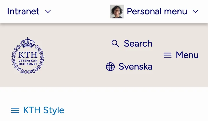
Don’t let the menu look ugly (“Search” on top of “Svenska”) in devices with width 360px:
-
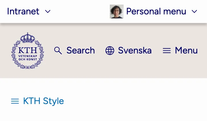
Logotype’s margin is adjusted to avoid misalignment:
Example: header at KTH in resolutions between 320px and 360px
-
The header should not present accessibility issues between 320px and 360.
-
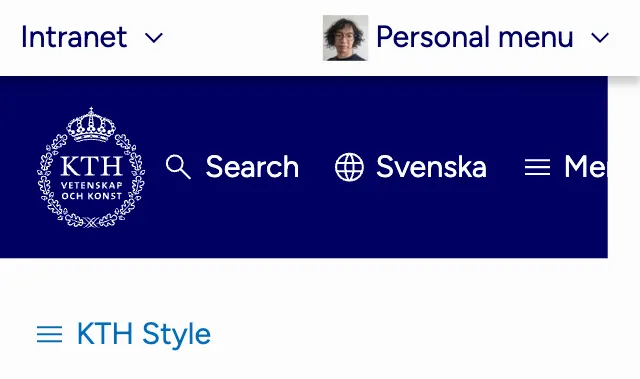
Don’t let the “Menu” button leak outside of the background. It causes contrast issues:
-
The property
flex-wrapis added to avoid items to leak outside of container: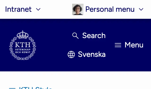
Browser support
-
Use features supported in all stable versions of core browsers (as defined below).
-
Do not use features marked as experimental, deprecated or obsolete by MDN. For example, do not use
virtualkeyboardpolicy -
Avoid accessibility or major usability issues in browsers that are less than 24 months old.
-
It is ok to offer a slightly degraded experience for users that have browsers older than 6 months.
Avoid using polyfills or “hacks” to force an optimal experience to all users
Core browsers, at the time of writing, are:
- Chrome for desktop
- Firefox for desktop
- Safari for desktop
- Edge for desktop
- Chrome for Android
- Firefox for Android
- Safari for iOS
The values in this section (including the definition of core browsers) are based on
- Usage data collected in KTH analytics
- The Web Platform Baseline initiative described below
Example. text-wrap: balance
A developer wants to add the CSS feature text-wrap: balance. When added to a header, for example a hero, the text becomes balanced.
-
Without “text-wrap”, the two rows of text in the hero are “Join us to transform yourself and” and “the world”:

-
With “text-wrap”, the two rows of text in the hero are “Join us to transform” and “yourself and the world” making both rows more balanced

Can you use text-wrap in this case?
- Is this feature experimental, deprecated or obsolete? No
- Is this feature supported in all core browsers? Yes
- From which date is
text-wrapsupported by all core browsers: latest browser to release this feature was Firefox on 2024-03-19, around 3 months ago (at the time of writing) - What are the negative consequences for users using older browsers: they see an unbalanced text.
In this case, the negative consequences are very small: no accessibility or usability problems are present, so might be OK to use it.
Read more
-
Baseline is a project created by the Web DX Community Group in collaboration with major browser vendors (Apple, Google, Microsoft and Mozilla). Baseline information is displayed for example in some pages on MDN and even in caniuse.com
-
Defensive CSS are a collection of tips to build “safe” interfaces
-
Interop 2022 (and 2024, 2024) is a benchmark agreed on by all major browser vendors to solve compatibility issues across browsers