
Colors
Color system in KTH Style is based on KTH graphical identity and implements accessible contrast requirements by default.
Reference tokens
You should not use reference tokens if there is a semantic token available.
The new graphical identity defines 6 tones of primary colors. Five blues and one beige.
| Name | Hex value |
|---|---|
| $color-sand | #e6e1dd |
| $color-blue-kth | #004791 |
| $color-blue-sky | #6298d2 |
| $color-blue-marine | #08004f |
| $color-blue-light | #e0edfc |
| $color-blue-digital | #221dd9 |
In addition to that, KTH Style uses the following colors to meet various needs
| Name | Hex value |
|---|---|
| $color-white | #fcfcfc |
| $color-gray-light | #e6e6e6 |
| $color-gray-medium | #a5a5a5 |
| $color-gray-dark | #323232 |
| $color-black | #212121 |
| $color-blue-lake | #036eb8 |
| $color-red-light | #fad6d6 |
| $color-red | #d8351e |
| $color-red-dark | #bf2c17 |
| $color-green-light | #d8ffe7 |
| $color-green | #3f824e |
| $color-green-dark | #366f43 |
Semantic colors (semantic tokens)
Different semantic tokens in some themes can be the same color but should not be used interchangeably. Their value can change in different themes.
Example:
- In the “defualt theme”,
--color-backgroundand--color-on-primary(color for the text of the button) are both white - In the “intranet theme”,
--color-backgroundis beige but--color-on-primaryis white.
Surface, primary, secondary and tertiary colors
Surface colors are used for large surfaces like a header or the whole page. They are:
--color-backgroundand--color-background-alt. Color for the background of the surface--color-text. Color for texts that are directly written on the surface
Primary colors are used for UI components with a “primary” appearance:
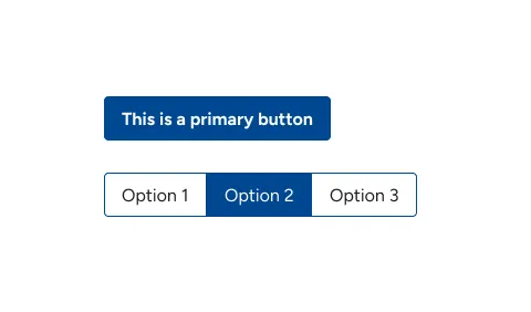
--color-primary. Main color of the component. For example the background of a button--color-on-primary. Color for elements inside the component. For example texts and icons of a button
Secondary colors and tertiary are used for UI elements with secondary and tertiary appearance:
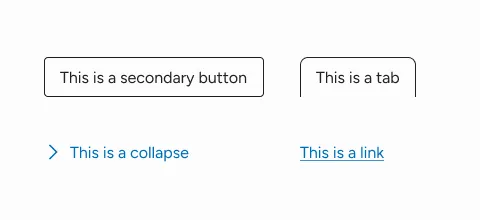
--color-secondary. Main color for secondary components with borders. For border, texts and icons--color-tertiary. Main color for secondary components without borders. For texts and icons
Accessibility: UI components that use --color-tertiary must be distinguishable from non-interactive text that surrounding them. For example:
- A decoration: an underlined link
- Extra elements: icons for collappse and dropdowns
- List of links where the title (not a link) have a different font style
Success and error colors
Used to indicate success and error.
UI components should not rely only on color to convey error or success meaning. Use icons, labels and other additional elements

--color-error. Color for errors. Used in borders, texts and backgrounds of UI elements--color-success. Color for success. Used in borders, texts and backgrounds of UI elements
Other colors
We are still working on this
We are still working on colors for:
- Separators. We are testing how different colors look like with different backgrounds
- Shadows and backdrops. This might be a single variable that defines entire properties (like the entire value for
box-shadow)
Colors for states
We are still working on colors for hover, active and inactive states
Some components need to signal an “active” or “inactive” states:
- Checkboxes and radio buttons when they are checked
- A dropdown when its opened
- A menu item when the link refers to the current page
- Selected and unselected tab
We haven’t found yet any clear pattern nor a set of colors that signals “active” universally. Specific components might need special colors designed exclusively for them.
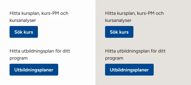
Contexts (themes)
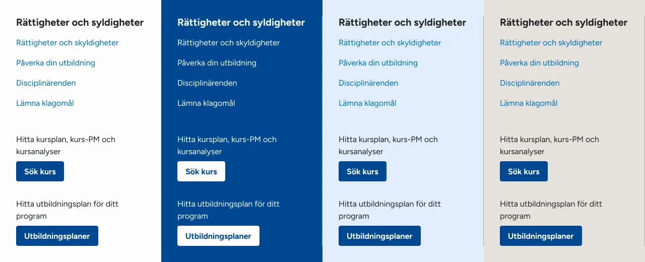
KTH Style defines the following 4 color themes:
theme-color-default.theme-color-inverse. For the header in kth external webtheme-color-intranet. For the header in intranettheme-color-student. For the header in student web
Accessibility
Check contrast requirements in color accessibility test.
How to use semantic tokens
Initialize the variables
Use the reset utility to set the default values for semantic tokens
@use "@kth/style/scss/utils/reset.scss";When creating a component
When building a component, use the appropiates CSS custom properties. You can provide default values but are often not needed
.search-form__button {
  background: var(--color-primary);
  color: var(--primary-on-color);
}
Switching between themes
To set a different theme in a region of a document, use the Sass mixins theme-<xxx> provided in colors.scss.
For example, to apply the theme “intranet” inside elements with the header class:
@use "@kth/style/scss/tokens/colors";

.header {
  @include colors.theme-intranet;
}