

Spacing
Spacing system in KTH Style is based on a 8px grid and helps to add hierarchy between UI elements
Spacing system
In this documentation, we use 1/16 rem as unit. For example, a padding value of 8 means 8/16 rem or 0.5rem
Why?
- Why
reminstead ofpx? It is important that font size and measurements (widths, heights, paddings) keep the same proportions for accessibility and usability reasons. CSS pixel is not proportional to base font size if the user changes their settings. - Why
1/16? It is equivalent to 1 CSS pixel by default in all major browsers
KTH Style spacing scale is based on Atlassian design system and defines 14 different spacing values.
- Small values: 0, 2, 4, 6 and 8
- Medium values: 12, 16, 20 and 24
- Large values: 32, 40, 48, 64 and 80
The scale is not linear but exponential. Smaller values increment by 2 and larger ones increment by 8 and even 16
All values in the scale are defined as reference tokens.
Spacing within a component
KTH Style defines two semantic tokens for spacing inside a component.
--space-inner-inlinefor inner padding in the inline axis (horizontal)--space-inner-blockfor inner padding in the block axis (vertical)--space-inner-iconfor inner padding in both axis when the content is only an icon
Those tokens ensure components can be placed next to each other and have consistent sizing
Spacing between components
KTH Style offers reference tokens to add spacing between UI elements. For example:
@use "@kth/style/scss/tokens/spacing";

.list {
  gap: spacing.$space-4;
}
Contexts (themes)
KTH Style defines two spacing themes:
theme-spacing-defaulttheme-spacing-compactfor “compact” interfaces like the personal menu or a dense table
How to add padding in a new component
KTH Style components have these constrains already built-in
Components with correct inner padding values have a consistent size, which makes it easier to align them.
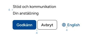
Block axis padding
- Use
--space-inner-iconif the component has only an icon (like the “star” button in the example below) - Use
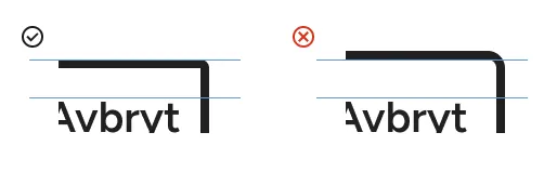
--space-inner-blockfor everything else - Substract the border from the padding (like in the button “Avbryt”)
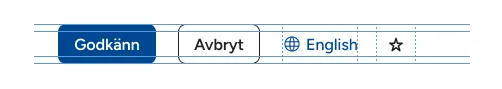
button.godkann {
  padding-block: var(--space-inner-block);
}

button.avbryt {
  border-width: $border-1;
  padding-block: calc(var(--space-inner-block) - $border-1);
}

button.english {
  padding-block: var(--space-inner-block);
}

button.star {
  padding-block: var(--space-innere-icon);
}
Inline axis padding
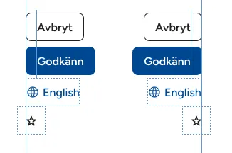
- Use
--space-inner-iconif the component has only an icon (like the “star” button in the example). Add a negative margin to align the visual area without shrinking the click area - Use 0 if the component has no borders nor backgrounds (like the “English” button)
- Use
--space-inner-inlinefor everything else (like the “Avbryt” and the “Godkänn” buttons) - (Optional) Substract the border from the padding (like the “Avbryt” button)
button.godkann {
  padding-inline: var(--space-inner-inline);
}

button.avbryt {
  // Substracting the border here is optional
  border-width: $border-1;
  padding-inline: calc(var(--space-inner-inline) - $border-1);
}

button.english {
  padding-inline: 0;
}

button.star {
  padding-inline: var(--space-inner-icon);
  margin-inline: calc(-1 * var(--space-inner-icon));
}
How to add space between components
Design tips
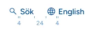
Minimum spacing between elements
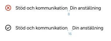
Make sure that there is enough space to avoid confusion with a “white-space” character.
- Use at least 16 between texts in the inline axis. 4 or even 0 is enough in the block axis.
- For everything else, there is no minimum space.
Use spacing to group elements by semantic proximity
- Related elements need smaller space between them
- Less related elements need bigger spacing
Practical example on how to add spaces
-
Add space inside components
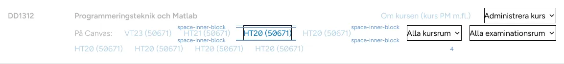
-
Start adding space in small groups, usually deeper in the DOM tree. 16-24 in the inline axis and 0-4 in the block axis is usually enough
-
Add bigger spacing between groups of groups.
Tip: use
margin: autoin flex aliged elements to get maximum margin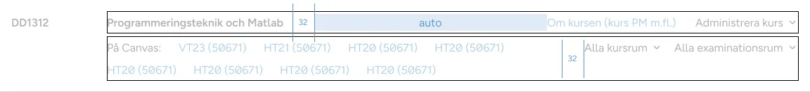
-
Continue adding spacing to bigger groups
-
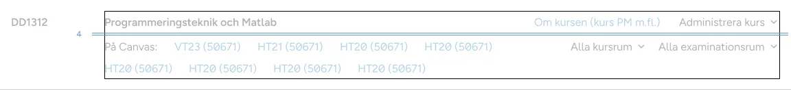
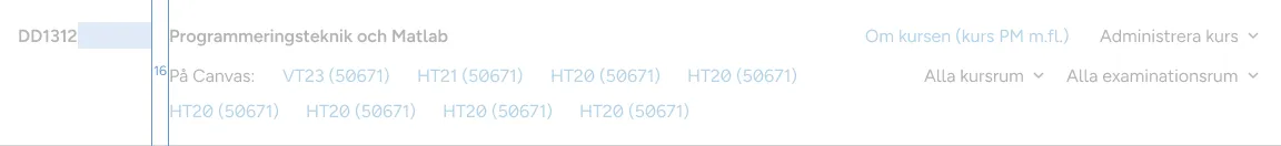
There is no need for big spacing if there are other visual clues, like a big space below the “course code” in this image:
Tips for developers
This section involves layout. It’ll be moved to a specific page when ready
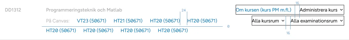
Use CSS gap in grid and flexbox layouts
gapis applied only between elements, so you don’t need to substract margin nor padding in elements that are in the edges of the containergapallows two values, one for each axis.
Add flex-wrap as defensive CSS
Use flex-wrap: wrap in lists to allow elements to span to multiple lines. Remember to adjust gap in both axes.
This is a “defensive” measurement. You should not design specifically for the rare cases, but you can make sure the rare cases don’t look broken
Further guidance
Consult KTH Style group in case you have different spacing/layout needs.