
How to make government information more understandable

In a polarized time when facts from researchers and politicians can be misinterpreted or distorted, the need for comprehensible knowledge dissemination is increasing. KTH student Tiago Maranhao Barreto Pereira's thesis examines how government data can be presented in new ways so that we understand how things are connected.
Democratically elected governments face similar problem: getting citizens to understand how government works, why decisions are made and on what basis.
Decisions and work are based on government data, data that can be difficult to interpret and understand for a variety of reasons (see fact box). This leaves room for interpretation and, in extreme cases, distortion.
Playful experience
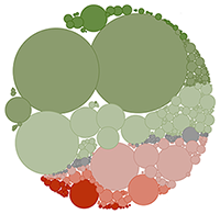
One of the biggest challenges is to produce information that can be communicated in an understandable way. This is where KTH student Tiago Maranhao Barreto Pereira's thesis comes in. In his thesis, he visualizes economic data from the Brazilian government using bubble charts equipped with special functions for greater comprehensibility.
"My presentation differs from a traditional bubble chart because the bubbles or circles can change, compress or expand when the user taps or drags them. This allows for a playful, almost game-like experience," Maranhao Barreto Pereira says.
Not an accurate picture of reality
What he wants to achieve with his bubble charts is to add new dimensions to presenting data. The stretchable boundaries and shapes of the bubbles make the viewer think. One of the ideas is that the visualization of data should not be seen as an exact representation of reality.
"All datasets contain some degree of uncertainty. This is often forgotten. Or ignored when the data appears to take on precise forms in a well-executed visualization," Maranhao Barreto Pereira says.
Pushing bubbles
In data representing highly abstract information, such as the Brazilian economic data visualized by Tiago Maranhao Barreto Pereira, classification and grouping can be interpreted differently. This can have a major impact on how data is perceived. Those looking at the data may make misinterpretations that the data do not support. The soft boundaries of the bubbles and the varying shapes and sizes in the visualization help to mitigate the illusion of excessive precision.
"The 'pushing' of the bubbles, in their limited container, can also be seen as a metaphor for how different expenditures compete for space in the public budget, reflecting the competition for more resources between the different areas," Maranhao Barreto Pereira says.
Question on democracy
The involvement of citizens in the exercise of authority - civic participation - is a matter of democracy. Whether democracy in a society works or not. Do you agree?

"I could not agree more. Participation is at the heart of democracy, but it cannot be limited to parliamentary elections. Active civic participation is essential for democratic governance and for promoting individual rights and freedoms," Maranhao Barreto Pereira says.
According to the OECD's 'Government at a Glance' report, effective participatory practices, among other things, require an informed public that can provide constructive input on public issues. The OECD recommends that public communication needs to change, so that citizens have more say.
"This will allow for an open, fact-based public debate. This project is a small step in that direction, a contribution to this necessary transformation," Maranhao Barreto Pereira says.
Text: Peter Asplund