Tables
Tables can be difficult to interpret - for both users with screen readers and others. They should therefore be used with caution.
Only for table data
Tables are used to organise tabular data clearly under columns and rows.
Always consider if a table is necessary. In many cases it is possible to present the information in plain text on the page.
Do not layout using tables. Users who use reading aids may not get the information in the tables at all or in the wrong order.
Use short headings
When a screen reader findss a table, it reads it cell by cell. Therefore it is important to have headings for each column for the user to be able to orientate. They are read before the contents of each cell.
Always try to keep the table headings short. If the headings are long, the user will hear them repeated over and over.
The same number of cells on all rows
Screen readers keep track of the place in a table by counting cells. If a table has split or merged cells, the screen reader cannot provide useful information about the table.
Avoid empty cells. They mislead someone who uses a screen reader to believe that there is nothing more in the table.
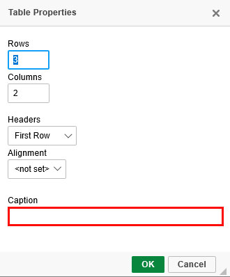
Caption the table
You can help the visitors by adding an explanation of the table that summarizes what it is about.
In Polopoly, this is done in the field called caption. The field should not be confused with column headings or with a heading for the content of the page.

