Structure and headings
Prioritise your content to make it easier for the visitors. A clear structure with descriptive headings makes it easier for users to find and understand the content.

Information structure
Start clear and broad high up in the structure. Further down the structure you can be more specific.
Menus
The menu on your pages is important to the experience. If you manage to create a simple and flexible menu, those who visit your pages will find it easier.
-
Keep the menus short. Too many choices confuses visitors.
-
Use words that visitors are searching for. Avoid internal expressions and abbreviations that are not widely known.
-
Remove all unnecessary words and keep each menu choice as concise as possible.
-
Arrange the menu so that the most important is at the top. Alphabetical order is only suitable for names, for example of people or places.
Publish the same contents in more than one place
Avoid cross-posting in pages because they might be good to have. We have different target groups in different parts of the site and you may need to adapt your text. There is also an increased risk of users getting into the wrong context when finding the page by searching with cross-posting. It is also harder to find the content in searches. Rather, write a shorter customised text and link to the place where the visitor can read more.
Page structure

A good page structure is simple, fast and easy to use. It is essential that it is clear and does not create a noise with a lot of unnecessary information. The most important content should come first!
Split the text into several paragraphs and the page is perceived as light and easy to read. It makes it easier for the reader if each topic or line of thought gets its own paragraph. It is especially important for those who have reading difficulties.
Group the content so that what belongs together is also visually connected. For example, what does not belong to the main content can be put in a teaser.
Write descriptive headings
Good headlines are essential for everyone to be able to find and understand the content. Headings need to be clear and descriptive. Use words you know the reader is looking for and that describe the content. Use a unique description, such as Contact the study counsellor instead of just Contact.
The web page becomes more functional through consistent and descriptive headlines. For people navigating with the keyboard or using screen readers, it provides an opportunity to jump to different parts of the content. People who have reading difficulties and reduced short-term memory are given the opportunity to envisage what each part of the site contains.
The law requires: Write descriptive headings and tags (Webbriktlinjer, in Swedish)
Headings are also important for the page to rank high in search results.
Subheadings
Subheadings are one of the best ways of highlighting information. Insert subheadings where they fulfil a function and can capture the reader. If you have a long text where you do not find anything that deserves to be highlighted with a subheading, it is better to shorten the text.
Heading levels
It is important to be thorough and consistent because support tools such as screen readers and speech synthesisers navigate the heading sizes to create an overview and the correct reading order.
Digital accessibility - requirements and opportunities
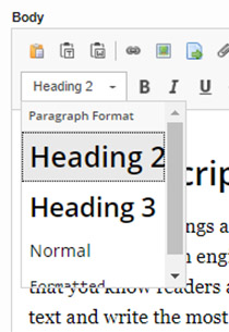
Polopoly has built-in functionality for subheadings. You should always use Heading 2 as the first heading level for subheadings. Heading 3 should only be used if you have multiple heading levels, never as a substitute for Heading 2.

