Images on the KTH website
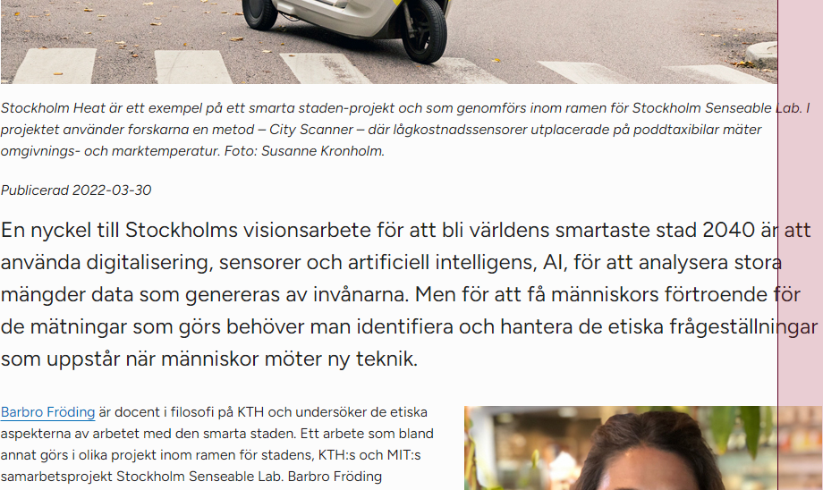
The website's maximum width in desktop view has been increased, which means that images that stick to the exact maximum width that applied previously no longer fill the full page width.
The website's maximum width goes from 1168 pixels to 1242 pixels.
Articles with a left menu go from a content area of 868 pixels to 920 pixels.
Full-width images in article
Images that have been adapted with exact widths to previous maximum widths now provide a gap to the right margin of the web page. In an article with a left menu, an image that is 868 pixels wide gives a distance of 50 pixels to the right edge of the content area.
A recommendation is to create full-width images with a width of 1000 pixels. They are then scaled down to the appropriate size.

Positioned images in teasers
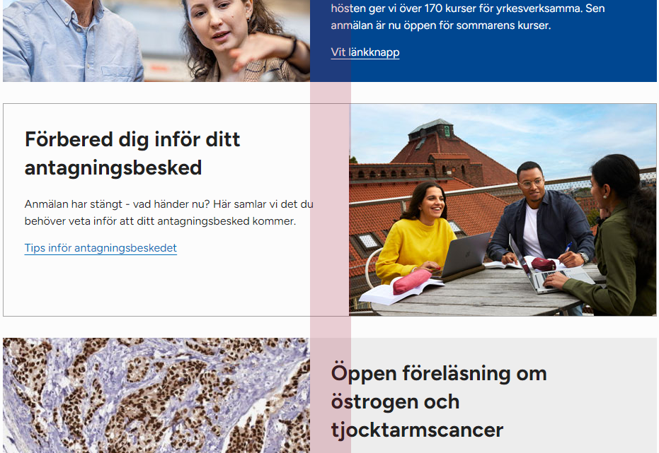
Teaser images that are positioned above the rest of the teaser content continue to fill the full width of the teaser.
Teaser images that are positioned left or right retain their original size as before. As the web pages are now wider, these images will take up less teaser space than before. Image dimensions set to let the left and right margins of images line up with each other no longer give the desired effect.

Teaser images are displayed in full width in mobile view. Teaser images should therefore be at least 500 pixels wide.
White background in image
The website now has a white background color with a slight gray tint. Images with a pure white background will provide a slight contrast to the new background. These images may in some cases require a frame before being uploaded to the image block. In other cases, the images need to have a transparent background. This typically applies to logos in PNG or GIF format.
What do I need to do?
- Make an assessment if your images in articles need to be re-saved to fill the full width of the page. This is especially important where full-width images are close to right-positioned blocks and give a deviant right margin.
