Typography on the KTH website
KTH's website now only uses one font: Figtree.
Previously, the KTH website used two different fonts: OpenSans for linear text formats, mainly for headlines and puff texts, and Georgia as a serif format for the body of the articles.
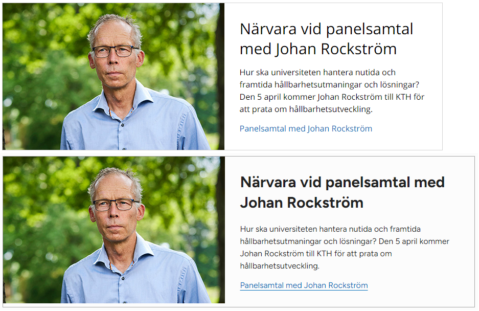
All text is now displayed in the Figtree linear font. The previous distinction between paragraph text in an article and a teaser block is ceased.
Teaser blocks get less text space
Different fonts have a different character. Even if changing the font adheres to previous text sizes, the text will take up space in a different way. For the KTH website, this mainly means that content in teaser blocks with a more limited area now may get a slightly different layout.
The increased space taken up by text is compensated to some extent by the fact that the web pages have generally become wider and therefore also the teasers. However, the new conditions mean that text that has been adjusted to images with a certain size may need to be adjusted.

Teaser blocks in articles no longer need a frame
As articles and teaser blocks previously had different fonts, teasers in the article area were always displayed with a frame, even if one was not set in the teaser template. This was to clearly distinguish the different text formats.
When the same font is now used, this is not justified. Teasers in articles that do not explicitly have a frame set in the settings will no longer be displayed with such.
Paragraph text in articles has shorter lines
To meet accessibility requirements, the lines for paragraph text in articles are shortened. Paragraph text in teaser blocks, however, still takes up the full width of the teaser.
What do I need to do?
- Go through teaser blocks that use left or right aligned images. Could adjustments to image or text content need to be made for a good balance between these?
- As teaser blocks no longer automatically get a frame in an article, teasers without a frame risk appearing as belonging to the surrounding running text. With the difference that the teaser's paragraph text is wider than the article's. Counteract the less appropriate in this relationship by giving the teasers a frame or a background color. In addition, use images to the left or right in full-width teasers to avoid unnecessarily long lines of text. Let teasers without frame be reserved for start pages or multi-column solutions.
