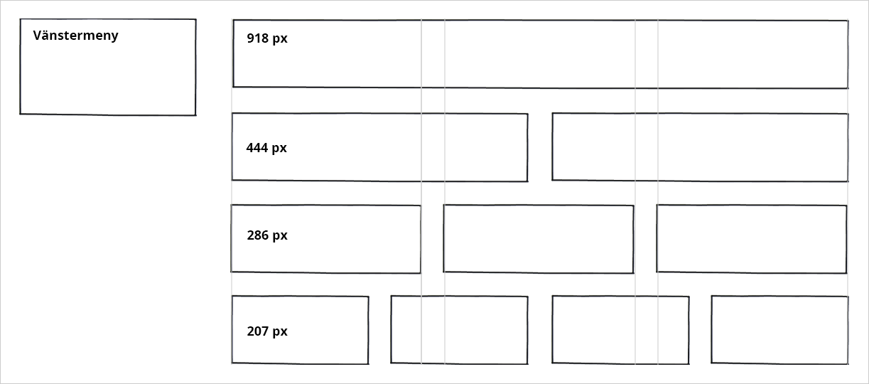
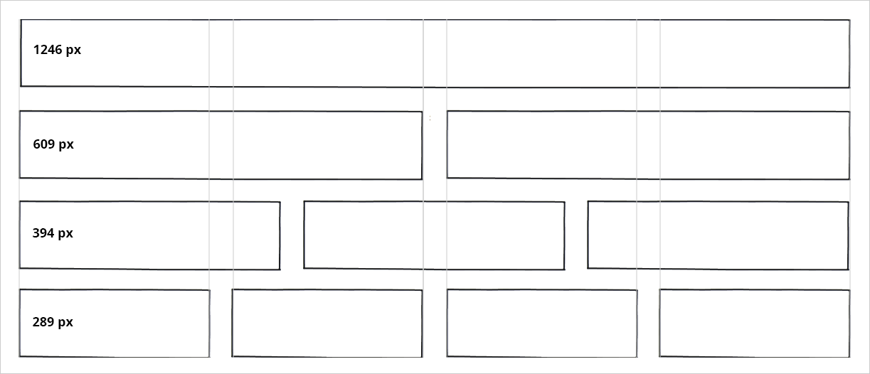
Column widths
The following widths in pixels apply to columns in desktop views.
In mobile views, all pages transition to single-column mode. Therefore, use images with a width of 500 pixels in columns that take up less width than that in desktop mode.
Full width page without left menu:
Full width page with left menu: