
Left menu on the KTH website
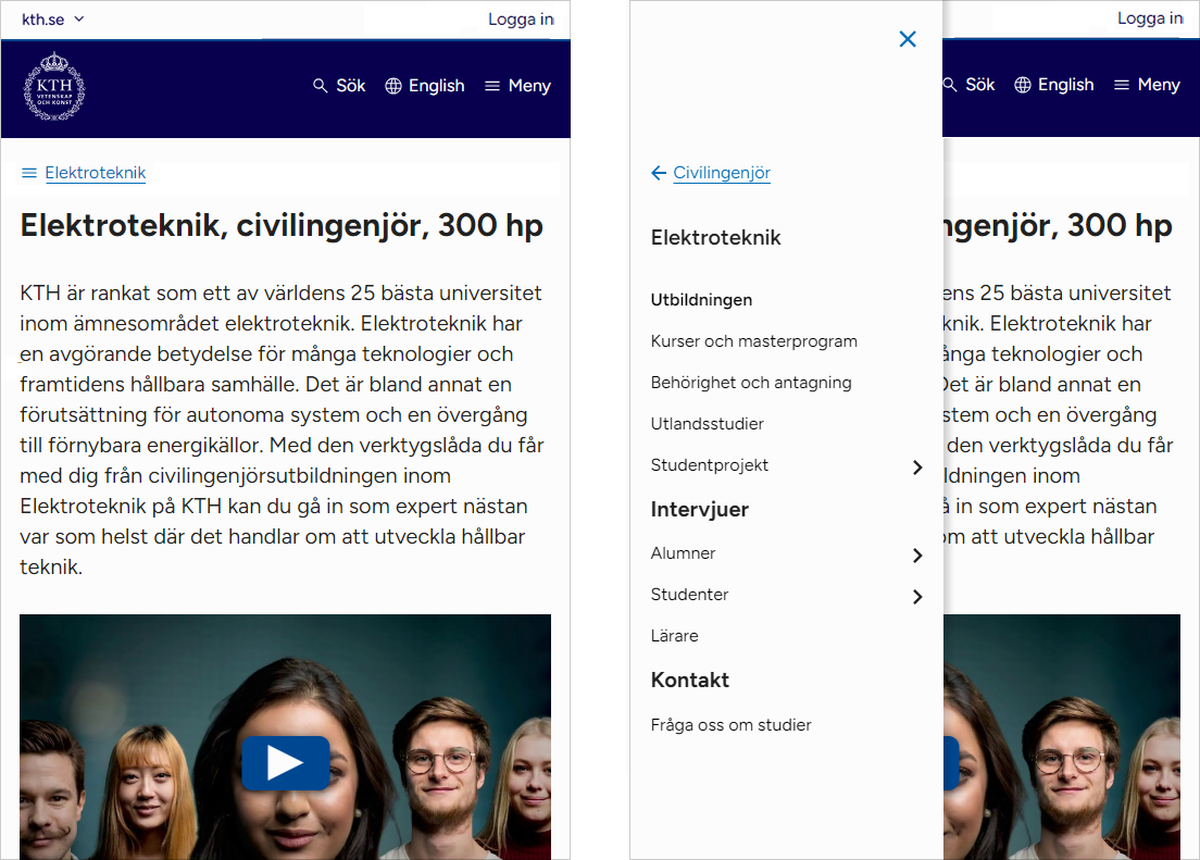
The left menu has its own menu below the page header in mobile views. It no longer takes over the menu in the header.
On mobile devices, the menu in the header now always refers to the mega menu. At article level, the left menu was previously displayed when clicking on the menu symbol in the header. Now the left menu gets its own menu icon directly below the page header on mobile. Clicking the icon folds out the left menu. The menu icon is supplemented with link text taken from the main heading of the left menu.
What do I need to do?
- The change does not require any action