Fonts
It's important to use the KTH fonts in a consistent way in headings, preamble and body text. This makes it easier for different target groups to identify and recognize the KTH brand. When you use the KTH templates in Office for example, the correct font is set automatically.
Guidelines for our fonts
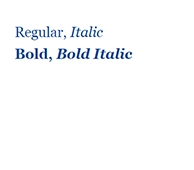
In order to maintain a consistent typography, there are specific guidelines regarding weights, alignment, and line spacing.
- We use the same font and typography in print and digital formats.
- In general, we use black text, but colored text can be used in headlines and shorter texts. In such cases, we predominantly use blue text.
- In our Brand guidelines (page 20) there are examples of how KTH's primary fonts Figtree and Georgia can be combined.
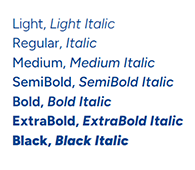
Font for headlines, subheadings, and concise body text
Figtree
Figtree serves as our primary choice for headlines, subheadings, and concise body text. It can also be employed in short body text. Figtree is an easily legible sans-serif typeface available in various weights. It features a clean and straightforward design with uncomplicated, open shapes, enhancing accessibility and readability in text.
Figtree is available for free download via Google Fonts or via KTH's software center.
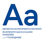
The images show examples from left to right of the typeface Figtree in lower and upper case letters, as well as in different sizes and variants.
Font for longer texts
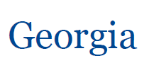
Georgia
For longer passages, we opt for the timeless and highly legible serif font, Georgia. Georgia is renowned for its smooth curves, ensuring excellent legibility on both screens and in print.
Georgia is a standard font preinstalled on all computers.
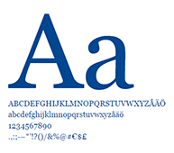

The images show examples from left to right of the typeface Georgia in lower and upper case letters, as well as in different sizes and variants.
Fallback font
Arial
In cases where Figtree cannot be used, Arial should be used as the alternative font. Figtree lacks certain special characters, such as those from Greek and Latin, which are sometimes used in scientific texts. If these characters are needed, the backup font Arial can be used instead.
Since Arial is a standard font preinstalled on all computers it does not require a fallback font.
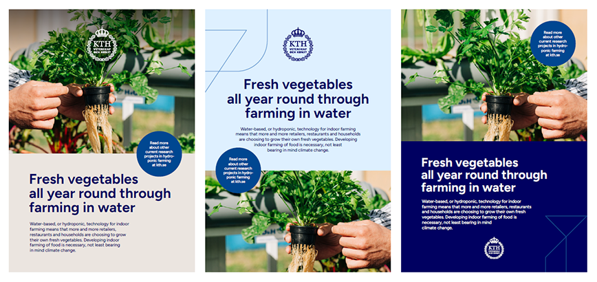
Text plates
In designed products where images and text are combined, such as covers, posters, or advertisements, text can either be placed directly over images (if readability can be ensured) or on a plate in one of our brand colors.
Considerations:
- Text plates are always full-bleed and can be positioned either at the top or bottom, but never both.
- The KTH logotype can be either placed on a plate or directly over an image.