Colors
When you use KTH's profile colors, you strengthen our brand, logotype and identity. Our primary color palette primarily consists of various shades of blue, with navy blue being featured in our logo. Our so-called functional colors and undertones are used in tone plates, diagrams, or illustrations for example.
Primary colors
KTH has seven primary colors. Our primary color scale has a focus on different shades of blue where the navy blue color is found in our logotype . You can use two different tones of each color. Together with the other primary colors, the color scale strengthens KTH as a brand.
KTH's primary colors and their color codes
U=Uncoated, C=Coated

Printing Primary Colors
Some of our primary colors in CMYK may depending on whether you have coated or uncoated paper. Contact our printer if you have any questions about which CMYK code to use.
Pantone's color libraries are not installed in Adobe's software. This requires that you work in PMS/CMYK in Adobe. If printing is needed, the printer can convert to the specified Pantone colors.
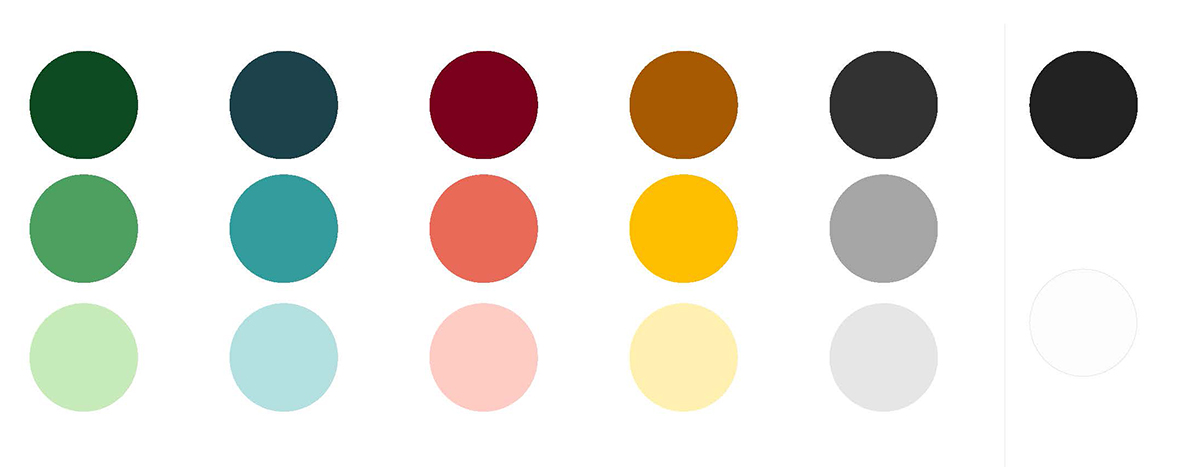
Functional colors
As a complement to KTH's primary color scale, our so-called functional colors are used. These are used for example in diagrams, reports and presentations. Please note that KTH's logo should not be placed against our functional colors.

Color and accessibility
When creating outputs in our primary colors, it is important to consider readability and accessibility . Different color combinations specify their contrast ratios to ensure that the contrast between text and background is sufficiently high for readability and accessibility. There are many factors that affect text readability, especially color contrast, text size, and font weight. You can read more about this on page 13 in the Brand guidelines.


