Logotype
KTH's logotype carries profound symbolic meaning, representing our identity as the sender. The logotype adds gravitas and credibility to the message. Consistent use of our logotype reinforces KTH's visibility.
Who can use the logotype and when?
Our logotype is to be used exclusively in situations where KTH asserts ownership, authorship, production, or operation.
- The logotype should be incorporated into all external communications.
- Employees are authorized to use the logotype in their professional work.
- Students may utilize the logotype solely in conjunction with their theses and dissertations .
How to use the logotype
The Brand guidelines on page 5-9 explains the rules for how the logotype is used with colors, size and placement. These rules should always be followed when using the logotype.
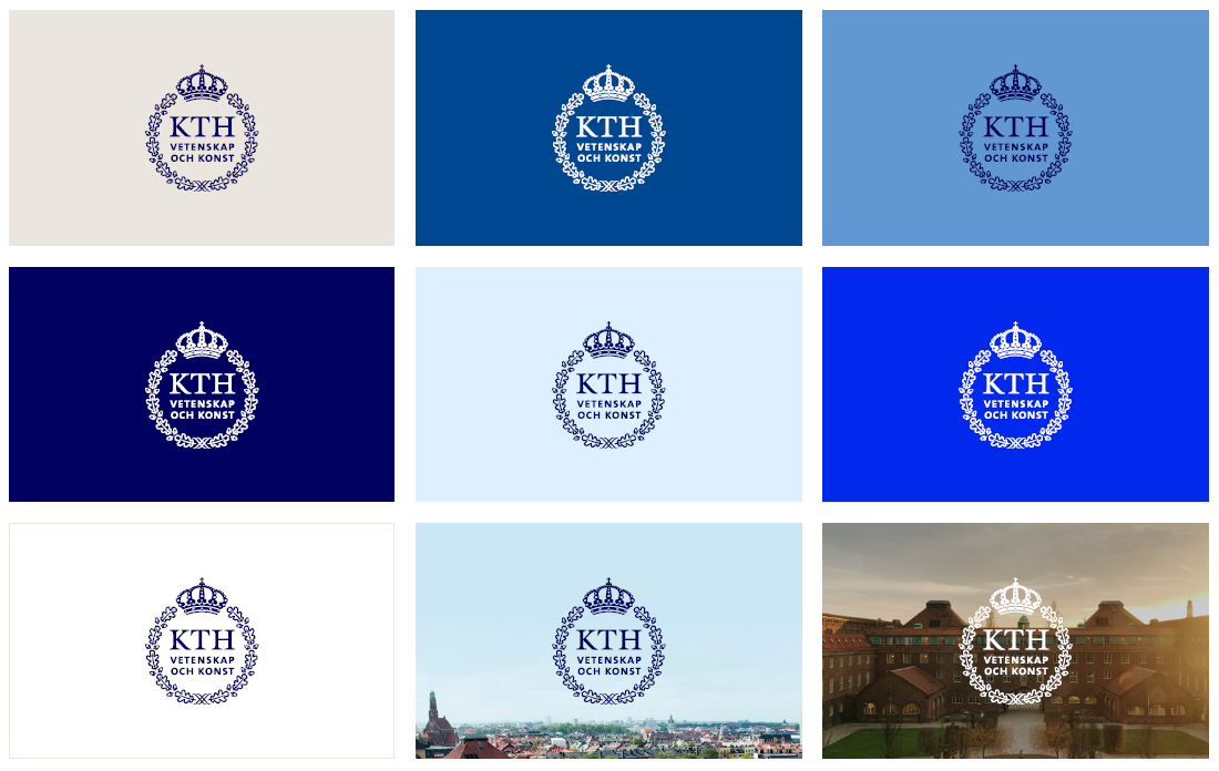
- Our logotype is used in navy blue when placed against our lighter primary colors , and in white when placed against our darker primary colors. Our primary logos can also be placed on image backgrounds (read more on page 6).
- The logotype should always be centered, either at the top or bottom of the layout.
- If used in a landscape format, the logotype can be centered vertically or placed in the corners (read more on page 9).

KTH's primary logotypes
Blue and white logotype
The navy blue and white wreath represents our primary logotypes.
- The navy blue wreath is positioned against our light primary colors
- White wreath is placed against our dark primary colors
- Both primary logotypes can be placed on image backgrounds
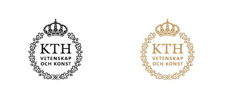
KTH's secondary logotype and special usage cases
In addition to KTH's primary logotypes, there is a secondary logotype with a black wreath and crown and a special exception in the form of a gold-foiled logotype.
- The logotype with the black wreath and crown is used when our primary logos cannot be applied, especially in cases of co-branding or for technical printing reasons.
- On special occasions, the logotype can be embellished in gold. Contact grafiskprofil@kth.se for guidance and approval.
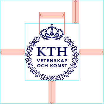
Safe zone and minimum size
Around the logotype, there is a safe zone, equal to the width of the crown. The safe zone represents the minimum distance to other graphics or text. This is to ensure the recognition of the logotype and to prevent any additions or decorations from being perceived as part of the KTH logotype.
- The logotype must not be smaller than 15 mm or 40 px in width.