

A User-Friendly Visual Identity

KTH is now receiving an updated visual identity that is more flexible, consistent, and better suited for digital channels. The revision is the result of a productive collaboration with employees from various parts of the organisation.
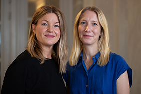
Malin Modig and Tove Guldbrand from the communications department have led the effort to update the visual identity.
Digital accessibility and flexibility have been the guiding principles throughout the process.
" Digital channels are playing an increasingly important role in KTH's communication, which demands that the visual identity complies with the legal requirements. Another crucial aspect is that the various graphic elements should be easy to use in many different contexts," says Malin Modig.
Tove Guldbrand adds:
" Now, we have one unified visual identity for everything, whether it's a branded product, printed material, or video. Previously, there could be differences.
Tove Guldbrand and Malin Modig are pleased with the outcome and highlight that the visual identity now provides more opportunities for utilisation.
The focus has always been on the organisation's needs for changes in the visual design, and many employees have had the opportunity to provide input during the process.
" We have listened to the organisation's wishes and tried to accommodate them in collaboration with KTH's contracted content production provider," says Tove Guldbrand.
Updated Graphic Elements
" The background panel behind the logo has been removed to create a more flexible and consistent profile. KTH's brand colours and line patterns have also been revised. Additionally, we have reviewed the font licensing costs and replaced fonts with free fonts," says Malin Modig.
The updated visual identity will be implemented gradually.
" Products with the old design and logo can still be used. KTH has until its 200th anniversary in 2027 to gradually phase out the old visual identity," says Tove Guldbrand.
Malin Modig concludes:
" From now on, it's preferable that everyone uses the new templates. Please share this with your colleagues and remember to update your email signature with the updated one.