How to create an effective and professional profile page

Presenting yourself and your research on your KTH profile page is a great way to be seen – as you want to be seen. This is not the time to be modest, a well thought-through profile page can do a lot of work for you.
There are different reasons why researchers don’t have an updated profile page at KTH, but the most common one is that there are other tasks with higher priority.
“You want to have it updated but this snowballs into your workload and after a year it seems like a huge task, and if you let five year pass it seems nearly impossible”.
The words are Mario Romero’s, researcher in Visualization at the Department of Computational Science and Technology.

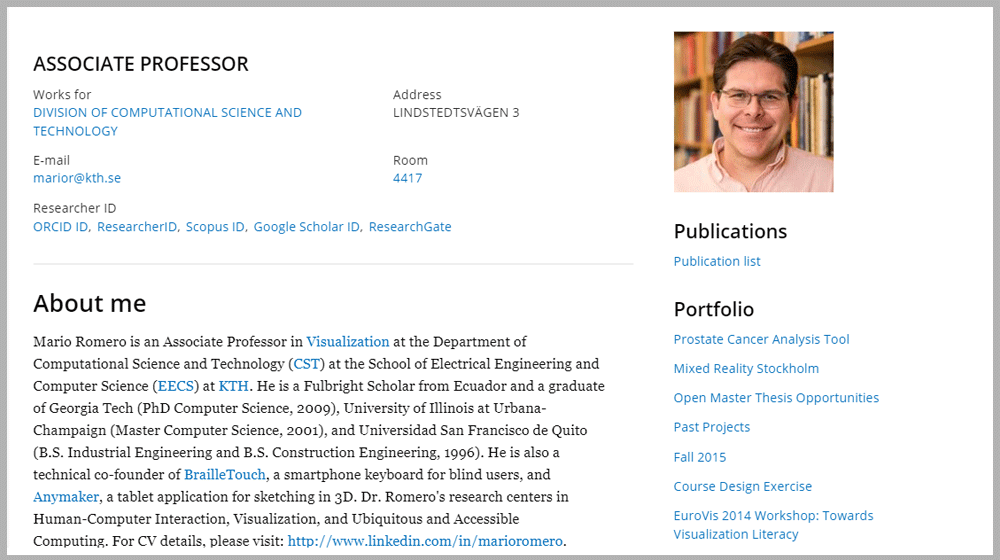
A sneak peek into Mario Romero’s profile page reveals a neat and easily accessible web page. In focus is quite an extensive table with recent projects and activities, each accompanied by a picture. This list Mario updates every few months.
“Going through this table of projects and activities people quickly get an idea of what I care about.”
“Your profile page is your visibility to the surrounding world. If people google your name and KTH, this is the first hit they’ll get. With an updated page I can decide the way I want people to find me and know about me professionally.”
The advantage with the KTH profile page, according to Mario, is that this is the official place where you have full control over the content. Some researchers chose to use their own servers to be in charge over the look as well.
“But I’m ok with the framework KTH has set up and appreciate its service and infrastructure.”
The use of small pictures is a very deliberate choice. Mario says he avoids having text on a web page without a picture summarizing its content.
“People will look at a picture and think ‘I want to read about this,’ but they will not do the other way around. I am competing with 3,000 other experts when applying for funding for example. So, if somebody needs to make a decision about me in 30 seconds or less, I can’t have too much text.”
But who does he expect to see his page?
First and most important of all target groups, he notes, is people looking for collaborators, for example when applying for grants.
“The ideal is someone who says ‘we need someone to do computer graphics, we found your web page an you’re a perfect fit…”.
Another important target group is colleagues and collaborators he has recently worked with. Here they can easily find updated information in order to copy and paste to anything, like a joint article.
“But it’s also useful for students who want to do research or project work with me. Here they can see if their interests are in line with mine. It’s also good if media needs an expert for a comment or interview – this is where they can decide if I’m their guy.”
Also, chose an updated profile picture. And here Mario confesses he’s got homework to do.
“I took the current picture four years ago. It’s recognizable but when people see me over Zoom they’re probably thinking: ‘Oh, what happened to you?’.”
How to get started
Starting from scratch, or are you behind with the updates? Mario’s says: “ignore a lot of the content and prioritize”. Here’s the minimum of information you should put on your profile page:
- Have a profile picture. Your communications team can help you get a decent one.
- Contacts – “Be meticulous with this part. E-mail and address are super critical. The address and room number take you to the mapping system. This way you avoid all the ’where-do-I-find-you e-mails’.”
- Publications – this is linked to the official KTH Library Diva system, which is important to bibliometrics. “I don’t have to do all the work here. The Library people keep it updated.”
- About me – Impersonal and short (under 100 words) - and keep it to the point. Use links in the text. Also link to LinkedIn where a visitor can find your CV. This really matters if you’re looking for a job, like if you’re a PhD student or a postdoc.
Do you have more time?
- Add a few links to official portals, to your work. You can only add ten links and all links in my profile except Twitter and Facebook (and possibly Slide share) are really formal.
- Portfolio – You have a limited number of subpages you can create, but here you can have specific project content that you have control over.
- For unlimited space – Mario created a table of recent activities and projects as part of the “About me” section. This table does not have a limit of rows. It includes images and links to the topics.
Text: Anna Gullers
